
Airology Case Study


The Problem
According to the EPA, the levels of indoor air pollutants are often 2 to 5 times higher than outdoor levels, and in some cases it can exceed 100 times. Airology circulates the air and traps harmful particles.
Overview
Airology is a consumer electronics company in the air purifier niche. They aim to help improve indoor air quality and make clean air more accessible to everyone.


The Goal
Create a consumer facing product website and mobile app to control the air purifier. Develop a seamless onboarding experience for pairing the device. Allow users to control the power, mode, timer, light, schedule, and manage their replacement filter subscription.
Responsibilities
User research, empathy maps, competitive market analysis, user personas, journey maps, wireframing, usability testing, iterating, prototyping, final design delivery.
Competitive Analysis
User Research
User Personas
Journey Maps
The User
Competitive Analysis
Before setting out to start designing the app, I compiled a list of 10 competitors in the space and set out to better understand the competition core features, strengths, weaknesses and any opportunities. To better understand the user, I went through the product reviews on the app store to see what actual customers were saying, what features they enjoyed about the app, what they thought could be improved, and ultimately identify any pain points.


Opportunities

Based on the competitive research, I compiled a summary of some key opportunities based on user feedback.
User Research
Research Methods
I used several research methods to formulate my hypothesis.
-
Analyze existing user feedback from competitors
-
Conducted 10 Zoom interviews.
-
Surveyed a pool of 20 individuals using Typeform.
Who are the users?
After diving deep to really understand who the ideal customers are that would use this product, I categorized my findings into 3 types of users. Novice users, competent users, and experienced users.
Novice Users
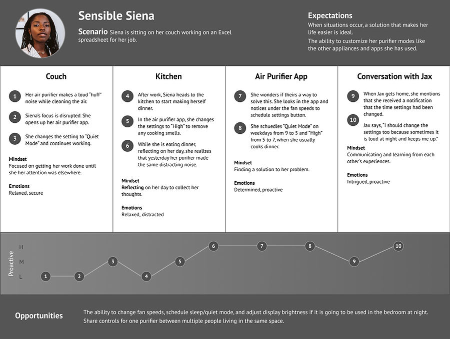
The novice users are new to the idea of air purifiers. They have never owned an air purifier. This user demographic falls into the young adults that are established enough to own their own space and make their own purchasing decisions. They have a willingness to explore how to better take care of their health and will buy new appliances to reach this goal. The novice feels empowered with learning new information as well as lets them trust the company more.
Being used to living in a technological age moving towards smart technology, they see this as the standard. They believe technology should make their lives easier. The novice user expects their smart air purifier to be as reliable as their other smart devices being able to customize and control their air purifier modes like the other appliances and apps they have used is a feature they enjoy.
Competent Users
Competent users currently have air purifiers in their homes and have decided to upgrade to a smart model. Many of the competent users mentioned that they live in a place where wildfire smoke affects their quality of living or themselves and others living in their house that was concerned for their health due to COVID-19. The motivation from them wanting to purchase is to have the ability to monitor the smart technology that the air purifier is doing a good job at filtering the air. It helps to give them peace of mind to have this knowledge.
Experienced Users
The experienced user relies heavily on the air purifier to help them with allergies and sensitives within their home. They have experienced allergy attacks, reactions and inconveniences throughout their life. They are cautious when buying a new product or appliance to help improve their allergies. They are tracking air quality outside and within their home. They plan their days around AQI data to avoid not feeling well.
User Personas
Based on the user research, I've created three unique personas that really get to the heart of the user behaviors, attitudes, motivations, and pain points.


Journey Map
The following diagram maps out the various stages of the user journey, tasks, feelings and opportunities.


Ideation
User Flows
Wireframes
Device Pairing User Flow
One of the most important core function is the pairing of the device. It is the first step users will take once setting up their account details. We wanted to make the experience is user friendly, directions are clear and process of pairing a new device hassle free.

Home Screen

Step 3

Step 1

Step 4

Step 2

Device List
Wireframes
Next, low fidelity wireframes were created to better visualize the user experience and journey in a more organized and structured way.


Refining the Design
Grid System
Design System
High-Fidelity Mockups
Brand Colors
The brand colors were inspired by the color of sky. We used sky blue as the core color. The color palette consists of primary, secondary and neutral colors that make up the design.
Grid System
The design uses a 4 column grid system with a margin of 24 pixels.
iPhone 11 Pro / X
375 px x 812 px

Typography
The typography a single font type with various sizes and styles to ensure it is easy to differentiate between headings and body text, and easy to read from an accessibility standpoint.

Iconography
Feather Icons
Author: Iconscout
UI Components
I have converted many reusable elements into components and variants as part of the design system that can be used throughout the design process to maximize efficiency and consistency.


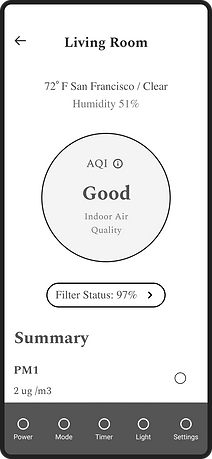
Shows Air Quality reading and device off position.
Display's time the room name assigned to the device and model.
Display's time and status of schedule.
Shows pairing progress when adding new device.
Shows status of air filter.
Dynamic status icon when checking Wifi signal strength.
Toggle for displaying air quality data over a period of time.
High-fidelity Mockups
High fidelity screens established a realistic experience to encourage useful stakeholder feedback.


