UX Case Study
ChowFresh


Product Description
ChowFresh makes it simple to cook delicious meals at home by providing weekly deliveries of fresh ingredients along with unique recipes perfect for the whole family.
The Problem
With everyone spending more time at home due to the pandemic, cooking a variety of meals at home is not an easy feat. Shopping for groceries, and finding high quality recipes takes a lot of time and effort. ChowFresh makes it easy.
The Goal
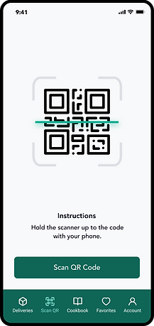
Design a mobile app for ChowFresh to allow users to view and change their weekly deliveries, scan and view recipes, provide cooking instructions, save their favorites recipes and manage their account.
Responsibilities
User research, empathy maps, competitive market analysis, user personas, journey maps, wireframing, usability testing, iterating, prototyping, final design delivery.


The User
Competitive Analysis
User Research
User Personas
Journey Map
Competitive Analysis
Before setting out to start designing the app, I compiled a list of 10 competitors in the space and set out to better understand the competition core features, strengths, weaknesses and any opportunities. To better understand the user, I went through the product reviews on the app store to see what actual customers were saying, what features they enjoyed about the app, and what they thought could be improved.
Food Preferences

App Features


User Research
Who are the users?
The users fall into three categories—novice, competent and experienced. These users have different level of cooking and meal kit experience. Ultimately, novice, competent and experienced users seek out a meal kit due to the convenience of the service.
Novice Users
The novice user is seeking to learn how to cook better. They are foodies but typically do not know where to start. They want to try new flavors and cooking techniques. They like that meal kits have the food pre portioned and measured for them. They also like the ease of being able to choose their recipes on the website or app.
Competent Users
Competent users know how to cook but have found grocery shopping and cooking to be too time consuming for their lifestyle. They often eat at restaurants, take out or use a delivery service like Uber Eats or Door Dash due to it being more convenient. They also have the awareness of how quickly eating out can get expensive. They are trying to make a change to cut their food spending without sacrificing their time.
Experienced Users
Experienced users have used meal kits before. They are sold on the idea because meal kits have saved them time, energy and money. They are usually parents and specifically moms that make up two-thirds of the purchasing decisions of the household. (Source: chainstorage.com) They are using the meal kits to feed their families and help them with their busy schedules.
Family-friendly plans, kid-friendly meals and ability to receive tips on how to make the recipes cater towards the picky eaters of the family are never overlooked. They appreciate the companies that consider their families within their products/meal kits. Experienced users know what their families like and how to cook already.
User Personas
Based on the user research, I've created three unique personas that really get to the heart of the user behaviors, attitudes, motivations, and pain points.


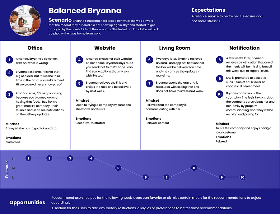
Journey Map
The following diagram maps out the various stages of the user journey, tasks, feelings and opportunities.


Ideation
User Flows
Wireframes
Wireframes
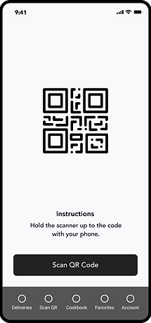
Next, low fidelity wireframes were created to better visualize the user experience and journey in a more organized and structured way.


Refining the Design
Grid System
Design System
High-Fidelity Mockups
Grid System
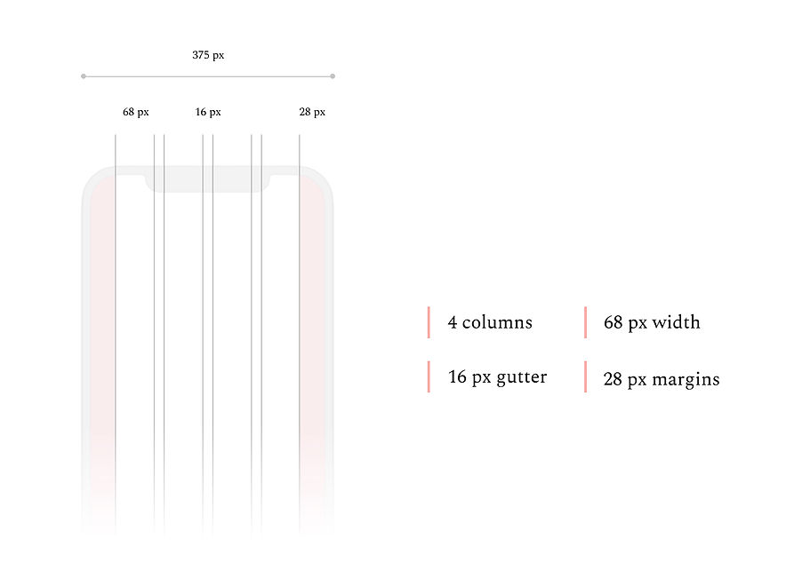
The design uses a 4 column grid system with a side margin of 28 pixels and a vertical margin of 20 pixels.
iPhone 11 Pro / X
375 px x 812 px
Brand Colors
The primary brand color incorporates a deep forest green which plays off the company name as the company focuses on delivering fresh ingredients to their customers. The color palette consists of primary, secondary and neutral colors that make up the design.
Typography
The typography utilizes a single font style with various sizes and weights for different devices.

Iconography
Feather Icons
Author: Iconscout
UI Components
60+ Components


High-fidelity Mockups
High fidelity screens established a realistic experience to encourage useful stakeholder feedback.