
UX Case Study
Corkbound


Product Description
Corkbound aims to make discovering wineries exciting and make the process of wine tasting more fun enjoyable, and memorable.
The Problem
With over 10,000+ wineries across the US, there is no centralize place where you can discover unique wineries, save personalize tasting notes, and manage your club memberships in one place.


The Goal
Design an app for individuals to discover unique wineries nearby or by region, save their favorite places, check-in by posting a review or photo, take tasting notes, and manage their club memberships from one place.
Responsibilities
User research, empathy maps, competitive market analysis, user personas, journey maps, wireframing, usability testing, iterating, prototyping, final design delivery.
The User
Competitive Analysis
User Research
User Personas
Journey Maps
Competitive Analysis
Before setting out to start designing the app, I compiled a list of 10 competitors in the space and set out to better understand the competition core features, strengths, weaknesses and any opportunities. To better understand the user, I went through the product reviews on the app store to see what actual customers were saying, what features they enjoyed about the app, and what they thought could be improved. I categorize the competitor apps into two different groups. One that focuses on wine experiences and one that focuses on wine discovery.
Wine Experience Apps

Wine Discovery Apps


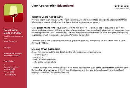
User Research
Who are the users?
The users fall into three categories—novice, competent and experienced winery and wine drinkers. These users have similar problems when finding wineries and quality wine while their different experience levels highlight opportunities to target within the app. Ultimately, novice, competent and experienced users want a quick and simple way to search for wineries that is faster than Google and has the proper filtering options to cater towards the best experience for them.
Novice Users
The novice users have the awareness of what wine is, drinking it occasionally when offered or purchasing it themselves at stores. Novice users in the past have viewed wine as just another alcohol. Due to coming into the awareness of the sophistication and cultural ties through wine, they are becoming more interested. They are seeking a new experience within our drinking culture.
Competent Users
Competent users have been to wineries before, have done tastings casually. They see wineries as a fun thing to do or a date night activity. Competent users, like the novice, appreciate the sophistication of wine. They know more or what they like and do not like regarding wine. Having wine apps helps them to organize their favorite places and wines.
Experienced Users
The experienced user has immersed themselves in wine culture. It is a part of their lifestyle and are willing to spend more on the best experiences and wines. They are signed up for different wine apps on their phones. Experienced users have wine cellars, have traveled to find the best wine and talk about wine knowledgeably. They are the users leaving in-depth reviews on wineries and the wines they serve at tastings. They go out with others that are into wine just as much as them and share trying new wines together.
User Personas
Based on the user research, I've created three unique personas that really get to the heart of the user behaviors, attitudes, motivations, and pain points.


Journey Map
The following diagram maps out the various stages of the user journey, tasks, feelings and opportunities.


Ideation
User Flow
Wireframes
Wireframes
Next, low fidelity wireframes were created to better visualize the user experience and journey in a more organized and structured way.


Iteration - Filtering Results
Based on user feedback, horizontal scrolling filter tabs were added to quickly filter search results based on specific winery features.


After
Before
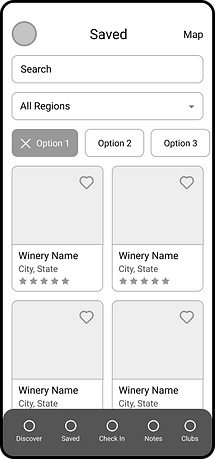
Iteration - Saved Wineries
In order to differentiate the experience between the "Discover" tab and the "Saved" tab, I opted to iterate the design to a two column list for the saved wineries tab. This gives the user a unique experience when engaging with their favorite wineries.


After
Before
Iteration - Search By Region
Based on user feedback, it was concluded that there should be more emphasis placed on the specific regions. The default drop down search was updated to create a more visual way to display the different regions for users to easily be able to plan their trip.


After
Before
Refining the Design
Grid System
Design System
High-Fidelity Mockups
Grid System
The design uses a 4 column grid system with a margin of 24 pixels.
iPhone 11 Pro / X
375 px x 812 px

Brand Colors
The brand colors were inspired by the color of grapes. The color palette consists of primary, secondary and neutral colors that make up the design.
Typography
The typography utilizes two different font styles with various sizes for different devices.

Iconography
Feather Icons
Author: Iconscout
UI Components
50+ Components


High-fidelity Mockups
High fidelity screens established a realistic experience to encourage useful stakeholder feedback.


