
Pinger Reactions
.png)

Overview
Messaging is at the core of Pinger products which include TextFree, Sideline, and Index. While sending messages is fundamental, lightweight expression—quick acknowledgment without typing—was missing.
I led the design and cross-platform rollout of Reactions, a native interaction allowing users to long-press a message and respond with an emoji.
The feature launched across:
-
iOS
-
Android
-
Web
It quickly became the #3 most-used feature after Calling and Texting with 32.1+ million reactions sent/received since launch from Jan 2025.


Problem
Messaging lacked a low-friction way to respond.
Users were:
-
Sending redundant messages like “👍”, “lol”, “ok”
-
Increasing message noise in threads
-
Slowing down conversations for simple acknowledgments
At scale, this created:
-
Cluttered conversations
-
Lower engagement efficiency
-
Missed opportunity for expressive interaction
👍
Ok
😂
LOL
❤️
?

Goal
Design and launch a fast, intuitive, and scalable reaction system that:
-
Reduces unnecessary messages
-
Increases engagement per conversation
-
Feels native across iOS, Android, and Web
-
Works across all Pinger messaging products
Designing Across Multiple Products & Platforms
Reactions needed to be shipped across multiple Pinger apps on iOS, Android, and Web, each with its own design system and native conventions. The challenge wasn’t just maintaining consistency across products, but ensuring the interaction felt native to each platform. We defined a shared interaction model for how reactions behave, while allowing the UI to adapt to platform conventions rather than forcing a single unified design.


Competitive Analysis
We analyzed how leading messaging platforms approached reactions, focusing on usability, scalability, and cross-platform behavior. While most products supported some form of reactions, their implementations revealed important insights, consideratinos, and tradeoffs.
Platforms like iMessage prioritized simplicity with a small, curated set of reactions and clean, fast interactions. This made reactions easy to use but limited flexibility. In contrast, most other apps offered a more expressive system with full emoji support, but at the cost of increased complexity and visual noise.
These insights highlighted a clear opportunity: design a reaction system that balances speed, clarity, and expressiveness, while ensuring a consistent experience across iOS, Android, and Web.

iMessage (Legacy)

Google Messages
Slack
Messenger
Telegram
User Research
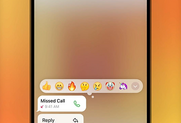
Early on, the team explored creating a custom set of reaction icons, especially after narrowing the experience down to a fixed set of six core reactions. While this approach offered more control over visual style and branding, it introduced additional design and maintenance overhead.
By conducting user research and concept testing, we found that the overwhelming majority of users preferred familiar emoji reactions over custom icons. Emoji felt more intuitive, universally understood, and aligned with existing messaging behaviors. An added benefit was scalability—by leveraging emoji, we could easily expand the reaction set in the future without needing to design, maintain, or localize a proprietary system.


A


B
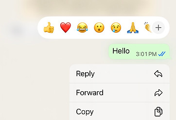
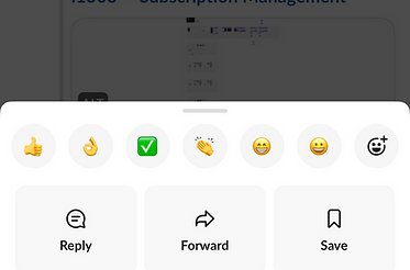
Placement
One thing we learned the user research was that people had a hard time seeing that there were multiple reactions when they were stacked together which was the iOS framework at the time. When we presented the Google messages framework where each individual reaction is visible in it's entirety evenly spaced out next to each other, the majority of users preferred this and stated it was much more clear and easy to understand.
We explored multiple placement options for reactions, evaluating how they would appear across different message types and conversation contexts. A key constraint was working within the existing message architecture—particularly in group chats where name attribution appears above messages, and in cases where additional metadata (e.g., Auto-Reply) is displayed below the bubble.
Placing reactions above or overlaying the message introduced conflicts with sender attribution and risked obscuring content. We ultimately aligned with a more scalable and familiar pattern by positioning reactions below the message bubble and anchored to its edge. This ensured a clear association with the message while maintaining visual hierarchy and readability.


Anchored to upper corner


Anchored to bottom edge
Decisions
After reviewing existing solutions, and conducting both moderated and unmoderated user studies, I worked with the stakeholders to narrow down scope and general direction. We decided to narrow it down to 6 main types of reactions and use the emoji vs custom reaction icons which seemed to be the standard across all other competitors other than Apple. In retrospect this was absolutely the right decision as shortly after releasing this feature, Apple also updated their reactions to use emoji's and now allows full support for all emoji types.
- Reaction Type - Custom vs Emoji
- Receiver vs Sender Styling
- Duplicate Reaction Handling
- Reaction Placement
- Edge Cases 1-1 vs Group
Trade Offs: We decided to only support 6 main emoji's for the initial release. On Android, the background blur was not a native behavior so we opted to adopt the native convention.

IOS

Android
Considerations
Designing reactions required careful handling of how they behave in one-to-one vs. group conversations, particularly around how multiple users interact with the same message.
1:1 Conversations
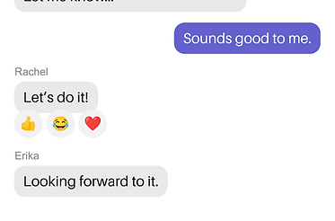
In one-to-one chats, reactions needed to remain simple and predictable. Each participant could apply a single reaction per message, with the ability to update or remove it.
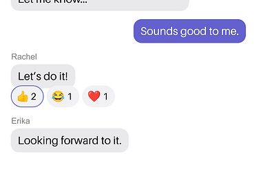
However, edge cases emerged when both users reacted with the same emoji. Instead of displaying duplicate reactions, we consolidated them into a single reaction with a count (e.g., 👍 2).
This prevented visual redundancy while still accurately representing both participants’ input.
The goal was to keep the UI clean while subtly communicating shared sentiment between users.

Multiple reactions of the same type

Consolidate + add count
Group Conversations
Group chats introduced significantly more complexity due to multiple participants reacting independently.
Key considerations included:
-
Supporting multiple reactions per message from different users
-
Allowing different reaction types (e.g., 👍 😂 ❤️) to coexist
-
Aggregating identical reactions into a single cluster with a count
For example:
-
👍 👍 👍 → displayed as 👍 3
-
👍 😂 👍 → displayed as 👍 2, 😂 1
This aggregation model reduced clutter and ensured reactions scaled effectively in high-activity threads.
Multiple different reactions
Multiple like-kind reactions
Message Types
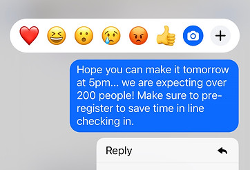
Text Messages
Text messages provided the most straightforward implementation. Reactions were anchored directly to the message bubble with a 4 px overlap, maintaining clear visual association without disrupting readability. The compact layout allowed reactions to remain lightweight and unobtrusive, reinforcing quick acknowledgment without adding noise.


Image Messages
For image messages, reactions were positioned to remain clearly associated with the media while avoiding obstruction of key visual content. Placement was carefully considered to preserve clarity, especially in media-heavy conversations where images are the primary focus.


Video Messages
For video messages, reactions needed to coexist with playback controls and interactive overlays. Placement was carefully validated to ensure reactions remained visually connected to the media while not interfering with core interactions like play, pause, or scrubbing.


Audio Messages
Pinger uses a reusable audio message component across all apps. Reactions were positioned to avoid overlap with these dynamic component elements, ensuring users could still easily play and pause audio without accidental interaction conflicts.


PDF Messages
For PDF message types, the 4px overlap was preserved to keep reactions visually anchored to the attachment. Given the structured layout of the component, we ensured the placement did not overlap with the file name or disrupt the tappable area used to open the document.


TextFree Theme
Since each product has it's own brand color themes, it was important to think about how we could apply the brand theme colors for active states. We maintain three different brand variable sets to make it easy to switch between brand themes as we iterate to ensure it looks good across all products.


Dark Mode
We have already mapped out all of our light and dark mode color variables so when designing new components, we regularly check for dark mode compatibility.


UI Components
Once the design was final, created a set of components for our design library to be used by our team which consisted of the different states and variants for the reaction bubbles as well as the reaction bar containing the 6 different preset reactions the team decided on.


Retrospective
Since launch from Jan of 2025, users have sent/received over 32.1 million reactions making it the 3rd most utilized feature after texting. Since launching iOS has updated their reactions experience completely and has moved away from static set of emojis and now fully supports all emoji types. Thanks to the learnings from the user research it was reassuring to know we made the right decision and did not box ourselves in.
Due to the success of the launch of the reactions feature we have discussed extending support for the full set of emoji reactions especially now that there is a very established UX/UI pattern across a range of different apps in the messaging space.